How to edit photos in Adobe Lightroom cc
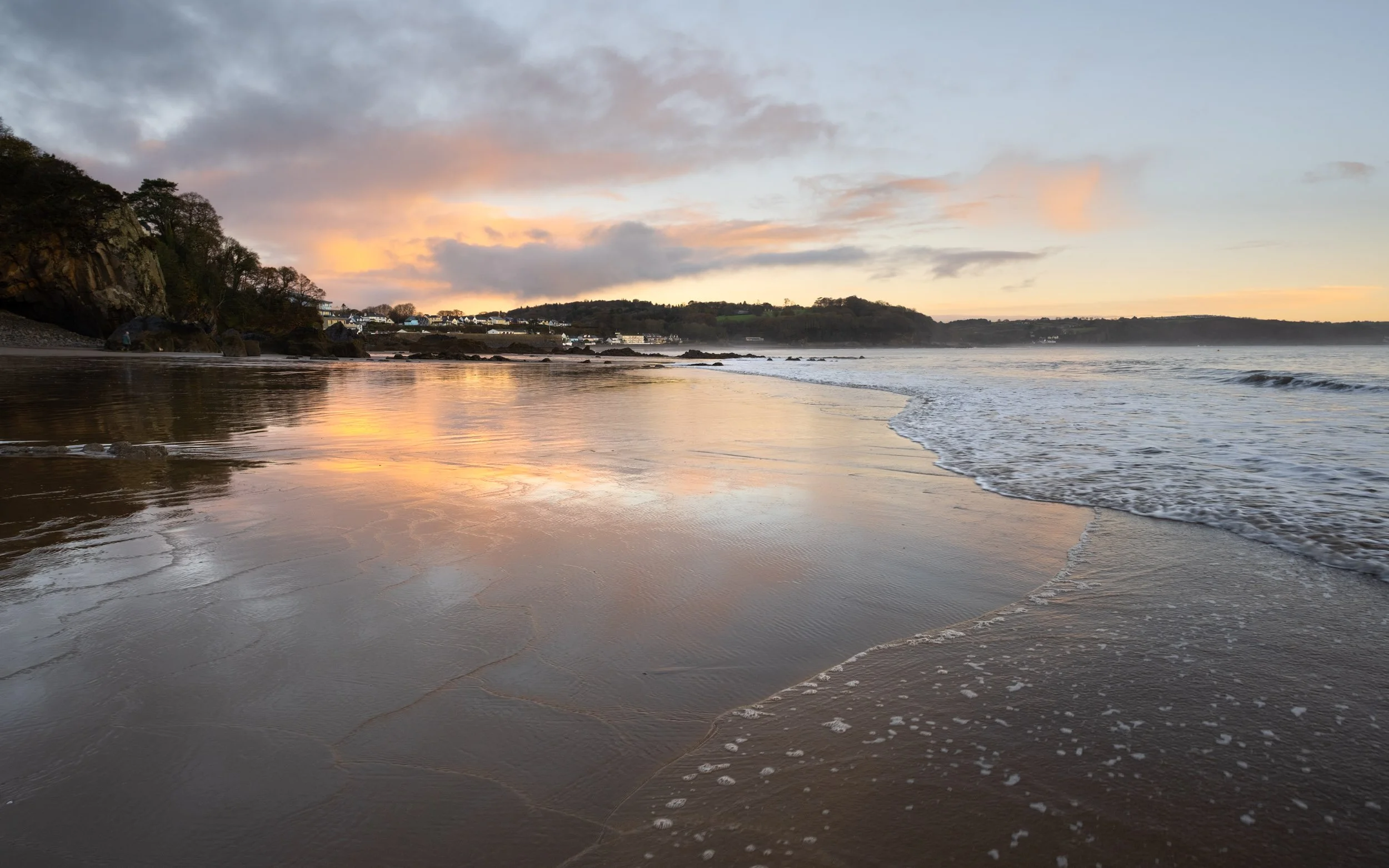
There are many ways to edit photos in Adobe lightroom cc and I will be focusing on Adobe Lightroom’s two main modules. The library module and the develop module. Getting great looking landscape photos can be really challenging, but if you follow the steps below you will be creating great looking photographs in no time.
MAKE LEARNING LIGHTROOM EASY
To make the whole learning process easier I have developed an online course that will explain the whole process in more depth and detail. It’s available for FREE, just follow the link below for more information.
If you don’t fancy taking the course, no problem. keep reading for lots of editing content that will help you to produce great looking landscape photos.
How to use Library module in adobe lightroom
The Library module is where you view, sort, manage and organize your photos. Essentially your home base for working with photos after importing them into Lightroom. Viewing your photos in the library module is much quicker than in the develop module as the previews are a lot lower in quality meaning they render a lot quicker. This is great for sorting and culling your photos. At the top left, you will see your navigator, essentially you can choose how you would like to zoom into an image, here you can choose how zoomed in you would like to go when you click the zoom button to view your photos, I usually check 1 to 1. Further down, you will see your hard drives and the folders that you have imported into lightroom. To find the source file on your hard drive right-click the folder and choose Show in explorer, this is really useful if you can't find your original photos. At the bottom you will see the import and export buttons, this is where you will import more photos. Along the bottom, there are a few useful tools, the grid view, the full view and the comparison view. We will cover these soon. Along the bottom, you will see your film strip with all of your photos that are currently in the folder in which you are viewing. most of the panels in Lightroom are collapsable, which can help keep your workspace clean and tidy, just click on the little triangles to collapse a panel and click on them again to re-open them.

how to use The develop module in adobe lightroom cc
The develop module looks very similar to the library module but the side panels are very different. At the top left, we still have our navigator but below that we have our presets and history tabs, the presets tab will show all of the installed presets and our history tab will allow us to undo edits that we have made by skipping back in time. At the bottom, the import and export buttons have been replaced with the copy and paste buttons. The whole bottom section is very similar to the library module but the right-hand side is now very different. The right-hand side panel is our main editing panel, this is where the magic happens.

HOW TO IMPORT YOUR PHOTOS IN ADOBE LIGHTROOM
Importing photos into lightroom and your hard drive is really easy, but there are few important things to do to make sure things run smoothly. First insert your memory card into your card reader, enter the library module and click the import button at the bottom left. This will open up a new page which we will call the import module.
If your computer has read your sd card, then your photos may already be loaded into a grid-like view in the middle. If they haven't automatically loaded you can come over to the left and select your file in the source tab. Simply click on the drive or card in which you wish to import from, and the preview thumbs will start to load. It's important to note - when the images are loading in the centre - they have not yet been imported to your hard drive, this is just showing you which files you have on that card, folder or drive.
To help the files load quickly set your thumbnail size to the smallest by moving the thumbnails slider all of the ways to the left. I usually have my sort tab, set to capture time if I am importing photos. This helps when you look through the files later. If I have video files or other media that I will not be importing on that card then I will set my sort tab to media type instead. This allows me to quickly identify the video files and uncheck them as they will all be grouped together.
I always import all of my files from every card that I upload. I think it is easier to sort images in the library module, you can then delete the ones you don't wish to keep later. If though you only want to import one specific photo you can uncheck all of the photos - search for your photo of choice and just tick that one. This means that when we hit the import button, it will only import that checked file. You can view the photos full screen by clicking the photo view button at the bottom left.
At the top, you will need to select copy as you will be copying the photos to a new location. Over at the right-hand side is where we have our import settings. At the top right, you will see the destination drive in which the images will be copied to. If I click on another drive, you will see this change.
Coming down to file handling, I recommend checking the build previews as standard. Without going into to much detail here - this will render your develop previews for you at a standard size. This means it's rendering the files on import as opposed to the first time you click on an image in the develop module. What this means, is that it will take longer to import the files, but save you time when previewing the files for the first time in the develop module as the rendering part will already have been done. If you will be zooming into a lot of your images it might be worth checking the 1 to 1 preview as this will render a 1 to 1 file instead. This will take even longer at import but again could save you time down the line. I always go for standard though, as it suits my style of working. I tend not to bother with file renaming until export.
Moving down to the apply during import tab. For develop settings, you can choose to apply a preset to all of your images. I don't do this for my landscape photography as I like to edit each image individually as the look I'm going for is often very different. I always use this for my wedding photography and family shots as it gives me a uniform base edit to work off. This helps to keep my look consistent, I have a number of presets that I have built over the years that save me a tonne of time.
Going down to metadata - this is where you can add copyright into the metadata. You only really need to do this if you are planning to share your images on the web and you wish to retain the copyright to the image.
Below metadata we have keywords, I always add a few descriptive keywords, usually based around the location.
Moving on to the destination. As the name suggests this is where you choose where your photos will end up after the import. First, check the drive you wish to store the photos on. Then select your main folder. This might be the location you store all of your landscape photography on each year - so you could have a folder called landscape photography 2020 and for future years landscape photography 2021 and so on, this will help organize your photos for each year. If you click on landscape photography 2020 and highlight it, then go up and check into subfolder, you will then be able to create a subfolder that sits within that yearly folder. This could be 01 the location then raw. ie: 01-lake district-raw. I find it is good to put a number first - that way they will all be in the order of the date captured. This method of filing is how I do it, but if you already have a system that works for you, then you may want to stick with how you are currently doing things.
You will want to make sure that organize is set to - into one folder, that way if you have multiple cards, that were shot over multiple days, all of the photos will end up in the one folder as opposed to multiple folders. When everything is correct, simply hit import and get on with something else while lightroom does its thing.

HOW TO SORT AND CULL YOUR PHOTOS IN ADOBE LIGHTROOM
After your import is complete you will see your destination folder in the folders tab in the library module. If you have imported photos on many cards, sometimes you will only see the last imported card in the film strip at the bottom. Just come over to the left and click once on your folder to bring up all of the files within that folder. You should now see all of your files in the film strip at the bottom. This is where we will cull or select the photos that we will be working on.
There are many ways in which to mark your files, but I like to flag mine. You can use P to pick and U to unpick your photos for selection. Use your arrow keys to move along the film strip from left to right. Right hand on the arrows and your left hand on the P and U keys. I use my index and ring fingers of both hands, but just choose what works best for you, it will also depend on where your arrow keys are situated on your keyboard.
When I'm culling large quantities of files, this method is super quick. If you like the photo hit P to flag it, if you don't like it, hit the right arrow key to move to the next image. keep doing this until you reach the end of the film strip. When you reach the end it will be time to select those files. Press the shortcut key ctrl L to enable filters, then click filter by a flag and flagged only. This will make the images in the film strip visible that you've previously flagged and the ones you didn't flag will become invisible in the filmstrip. Don't worry your unflagged images have not been deleted, they're just not visible, to make them visible again, just hit CTL and L to disable filters. All of your photos will now be visible again in the film strip.
When you have flagged your images, you can now go back through them and cull them further, if you have multiple versions. Simply press U on the flagged images to unpick them, this will make them disappear from your selection in the filmstrip. You can use compare view if you wish to view 2 similar images side by side - the shortcut key is C to switch between normal and compare view. The highlighted image will be your selected image, use the left and right arrow keys to scroll to your candidate image. The candidate has a little black diamond on the top right hand corner of the thumbnail in the film strip. This is a great way of choosing between 2 very identical images. Again just hit U on the image you wish to discard to unflag it.
THE DIFFERENCE BETWEEN GLOBAL AND LOCAL ADJUSTMENTS IN LIGHTROOM
In the develop module, we have two main ways to apply edits to a photograph. These are called global and local adjustments. Global adjustments mean that we will apply an effect to the whole of the image. As we move the exposure slider to the right we are adjusting globally to the whole image. As we move through the different editing tabs on the right you will see that whenever we adjust the sliders it is applying that adjustment to the whole of the photo. local adjustments are as the name suggests - they make adjustments locally, when an adjustment is made locally the adjustment will be targeted to one or several parts of the image as opposed to the whole image. This is how we can get really selective about which parts of the image we apply certain edits to. For example, we might only want to bring the exposure down in the sky area and not the land part of an image. With tools like a graduated filter, this is easily achieved, but we will be looking in these tools a little further on.
USEFUL SHORTCUTS IN ADOBE LIGHTROOM CC
There are many useful shortcuts that we can use in Adobe Lightroom and getting to know your keyboard shortcuts can really save time when you are editing lots of photos.
Here are some that I frequently use.
P to pick or flag a photo
U to unpick a flagged photo
1,2,3,4,5 giveS a photo a rating out of 5
6 to set the colour label to red, usually I set my edited web-ready images to a red colour label
9 to set the colour label to blue, usually, I set my edited print-ready images to a blue colour label
L turns the lights out, keep hitting L to turn down the background brightness. This allows you to see your images clearer
F to go full-screen press again to go back
I to show your camera information
ctrl and the + & - keys to zoom in and out of an image
Ctrl shift and E to go to the export menu
Ctrl L to enable filters
R crop tool
M Graduated filter
Shift M Radial filter
K Adjustment brush
W white balance selector
O when working with a brush shows the mask
O when using the crop tool to show overlays
Hold alt when dragging a slider to show where or how the effect is being applied.
\ to toggle between your edited and unedited photo
C to choose compare view
Ctrl-A to select all of your photos in the film strip
Ctrl D to deselect all of your selected photos in the film strip
These are based on the PC if you are using a mac then swap Ctrl for command.
There is also a much larger list of shortcuts on the adobe website.
The basics tab including white balance and profiles.

Before we go through the basics tab, let’s briefly talk about the histogram.
The histogram shows the exposure of your photo in a graph format. The histogram is a really powerful tool and it can help us to achieve a balanced photograph. Essentially the histograms graph displays the number of pixels that are displayed of a particular tonal value, everything that is black is on the left everything white is on the right. In the middle, we have mid-grey.
The higher the graph goes in a particular area shows how many pixels in the image fall within that particular tonal value. If I move the exposure slider to the left we will see that the image becomes underexposed and the histogram bunches to the left meaning most of the pixels are very dark or black. If we move the exposure slider to the right then we will see the exact opposite. The image will become overexposed and the histogram will bunch to the right where most of the pixels will show as white.
If you ever want to reset any of your sliders just double click on the word or the slider indicator.
In the basics tab, we can select whether we would like to work with a colour or black and white image. Below that we have the profile tab. By default, it is set to adobe colour. If you are shooting in raw, which I highly recommend, you can choose a different colour profile to work with. You can also save your own profiles or purchase them online, they are similar to a preset, but a profile will not make adjustments to your sliders where a preset will. If your camera has colour profiles attached you will be able to find them here. I use fuji cameras and if I scroll down I will see the fuji film simulations available for me to apply to my raw file.
Next up we have the white balance tab, This is where we can change the temperature and tint of the whole image on a global level. The temperature is measured in the kelvin scale, which is a scale that measures temperature the warmer the image the higher the Kelvin value, the higher the Kelvin value the more yellow and orange the image becomes. It’s the exact opposite for cold the lower the kelvin value the cooler the image becomes represented by the image going bluer in colour.
Below the temperature slider is the tint slider. If we compare the colour wheel to a compass, yellow is north then blue will sit directly to the south on the opposite side. The same is said for tint green sitting to the west and magenta sitting opposite to the east. Moving the tint and temperature sliders together will give us control over the whole of the colour wheel.
Using the colour picker or by hitting the shortcut W will allow us to use lightroom’s brain to do the work for us. Simply select an area that is completely mid grey and watch the colour and temperature sliders change in unison to give us a good starting point for our colour correction. keep using the picker until you get close to the look you are going for.
Next, we are moving down to the tone section. All of these sliders affect the image on a global level. I tend to stay clear of the Auto tab as I like to have full control over my edit.
Exposure - This one easy - simply drag to the left and it will darken the image, drag to the right and it will lighten the image. Press the shortcut J to see when your image is clipping or losing detail in the highlights or shadows. The clipping warning for the highlights is marked in red and the shadows marked in blue.
Contrast - Next is contrast, by adding contrast, essentially we are making the darker parts of the image darker and the lighter parts of the image lighter giving us more contrast. Watch your histogram as you add more contrast, the darker and lighter parts of the histogram get pushed more to the edges. The opposite will happen if we dial in a negative amount of contrast, watch the histogram move more towards the centre. I would use the contrast slider very subtly as there are more selective ways of adding contrast below.
Highlights - The highlights slider does as it suggests, increases and decreases the highlights in the image without affecting the shadows. This slider can be really helpful for recovering areas that looked too bright in the sky or water.
Shadows - the shadows slider does the exact opposite to the highlight slider affecting only the shadows, Using these 2 sliders in tandem is a great way of recovering areas of the image that are near to being over or underexposed, its also a more selective way of adding contrast.
The white and the black sliders are very similar to the shadows and highlights but affect the lighter and darker parts of the image, you need to be careful with these sliders but they are a great way of selectively adding contrast to an image. You can hold down Alt on many of the sliders to see how it affects the image. Using alt on the blacks, for example, will show us when a part of the image becomes completely black. If you are making global adjustments to a photograph for a quick edit using all of the sliders above in unison can give you a really quick edit and a nicely balanced shot.
Moving down to the presence tab, Texture increases or decreases the amount of medium size texture in a photo without affecting finer details. It's a great way of adding in some detail to your photo without adding in more contrast.
The clarity slider is similar to contrast, but it works a bit differently. The contrast slider affects all of the tones in a photo, while the clarity slider works more on the mid-tones. By increasing the clarity you will be bringing out more edge detail and by decreasing the clarity you will be softening the edge detail. You need to be really careful with the clarity slider as it can make the image look very grungy if pushed too high, I tend to never take it past + or -10
The dehaze tool work similar to clarity and can be great for adding or removing atmospheric conditions such as mist and fog to an image.
Vibrance is a tool which increases the intensity of the more muted colours and leaves the already well-saturated colours alone. The vibrance slider is great for portraits as it will leave skin tonnes alone and add in saturation to other areas of your image.
Saturation will boost the overall intensity of the colours in you photo just dial in the required amount.
HOW TO USE THE TONE CURVE IN ADOBE LIGHTROOM
The tone curve is a very useful tool and one which I use a lot. If you look at the tone curve you will see it represents the histograms graph. On the graph, we can see a line running diagonally from the bottom left to the top right. We can drag this line around to change how the tonnes in the photo are displayed. If we drag the bottom left-hand corner up you will see our black start to fade, if we drag it to the right we will see the blacks start in increase. Watch how the histogram changes as we move the tonne curve line. We can do the exact same to the white point too. If we drag it to the left the image has more white in it, if we drag it down we will push the histogram more towards the mid tonnes. This is really useful for setting our white and black points within an image.
The reason it's called a tone curve is that we can bend this line, by doing this we are able to manipulate the tones within the scene.
To add contrast, an S curve can be added. Lightroom has a couple of presets that are a good starting point to add medium or strong contrast. You will see the line becoming more shaped like an S. The shadow area on the left has been pulled down and the highlight area has been pulled up giving the overall image a boost in contrast. You can move these points further or less.
The tone curve is great because it's so flexible. It allows you to add contrast exactly where you need it. You can learn more about the tone curve by clicking on the line on the right. This will bring up 4 sliders, drag these and you will be able to see the tone curve move. This is a great way of learning the tone curve.
If you need to get rid of any points that you placed, simply double click them to remove them. If you need to adjust a part of your image and you're not sure where to start, click on the picker and start to drag it, you will see exactly where the tones fall on the graph.
Be really careful with the curve, try to keep it nice and gradual, having big steep curves can make your image fall apart and look really garish.
To the right we have our channel selector, by default, this is set to RGB meaning the curve will affect the red, green and blue channels at once. But we can break this down to single colour channels by clicking on either red, green or blue. Just for a quick example, by using the specific colour channel we can manipulate certain colours within either the shadows, mid-tones or highlights. If you look at the colour wheel you will notice that cyan and green is directly opposite red, so if we drag the red line up it will add red into the shadows but if we drag it down it will add the opposite colour to the shadows, in this case, a greeny cyan colour. Using the colour channels is a complex way of colour correcting and can work very well in some circumstances. In most cases, though I prefer to do my colour manipulation in the HSL tab.
HOW TO USE THE HSL IN ADOBE LIGHTROOM
Below the tone curve, we have the H S L Tab, H S L stands for hue, saturation and luminance. This is where we can selectively manipulate each colour individually.
I think this is a really useful tool if used subtly. I also think it is a lot easier to use than the individual colour channels on the tone curve. If you click on the All button we will see all of the HSL sliders and this is how I like to work.
To the left of each section, we can see the colour picker. We can use the picker to click on colours in our image that we would like to select and manipulate. Simply select the picker, drag it to the colour you wish to change and drag up and down while holding the left mouse button, you will now see the selected colours move on the relevant sliders. We don't have to use the colour picker though, we can slide the sliders independently just by dragging them.
At the top, we have our hue slider. As the name suggests we can change the hue of a particular colour. let's say for example we wanted to give an image a teal and orange look, all we would need to do is drag the yellow slider more to the orange hue and the blue slider more towards the teal colour.
Now below the hue, we have our saturation sliders, this is where we can adjust our colour saturation or the intensity of the colour, again this is really useful.
Now moving down to the luminance, again this is another useful tool. this allows us to change the brightness of a particular colour. So if we want to darken the sky we can grab our colour picker and pull down on the colours that we would like to darken.
Using these methods of controlling colour can be a very powerful way of editing.
If you are working in black and white and you have checked the black and white tab at the top the HSL will now become B & W.
Using this tab allows us to selectively dodge and burn certain colours within our image, dragging sliders to the left will darken them and dragging them to the right will brighten them. obviously, as we are working in black and white we cant see the colours, using the colour picker to choose an area that we wish to change can be really useful here. Let's say we want to make the sky a lot darker and more dramatic. We can do this by using the picker and dragging down on the part of the sky that we would like to darken. we can do the same for the land. Again another powerful tool here in lightroom.
GET CREATIVE WITH SPLIT TONING IN LIGHTROOM
Split toning is another great way of adding colour to an image, this time though slightly different. With split toning, we can add colour to either the shadows or highlights of an image. let's say for an image we want to warm up the highlights and cool down the shadows. First, we need to choose a colour for our highlights so let's pick a warm tone. Click on the small rectangle to get a better view of our colours and use the picker to choose a warm orange, by doing that we can see our slider has moved, we can move the slider manually as well, by holding ALT on the keyboard we get a view of the colour that we're adding. Now we can increase the saturation slider until we have warmed the highlights sufficiently.
If we reference the colour wheel we can see which colours complement each other, complementary colours sit opposite each other on the wheel. Opposite colour for orange is teal, as these colours complement each other we can add some teals into the shadows to cool them down. We can adjust the balance between the highlights and shadows by moving the balance slider, to get the required look.
We can see the before and after by using the toggle button. Again it's probably best not to push the slider too far as things can get a little false looking.
SHARPENING IN LIGHTROOM
In the sharpening tab, we can sharpen the image, I usually do this as my last step.
Now, how sharp you would like your image is obviously going to be a personal thing, I don't tend to sharpen my images too much, the fuji cameras that I use don't have an anti-aliasing filter, meaning that they are sharp straight out of camera, but if you use a camera with an anti-aliasing filter then you may need to apply a lot more sharpening than I would.
Usually, I keep my radius to 1, essentially this controls the size of the sharpening. Below that we have the detail slider, this is the slider that I use to sharpen my images and usually move this up to around 90, I then bring up my amount until I start to see any artefacts creeping in. Usually at around 20 is good for my cameras. To control where the sharpening is being applied, we can hold ALT and drag the masking slider to the right.
Everything in the image that is white will have the sharpening applied. Everything black won't, so just move this until you see the desired effect. Now, this method works well for cameras with x-trans sensors, but if you are using a camera with a Bayer sensor then you may wish to sharpen differently.
When I shot with my Nikon d800 I used to leave my detail slider at 0, radius at 1.0 and slide the amount to around 70, again using the masking to be selective about what is sharpened in the image.
I think sharpening is very subjective and varies from camera to camera. So my best advice would be to zoom into your image at 1-1 and play around with sliders and chose what works best for your eye.
Transform, lens corrections, effects
Lens correction can help if we see fringing on edges of tree branches for example. This is commonly known as chromatic aberrations. You can also apply a lens profile to correct things like distortion.
My cameras have a built-in profile so I never need to use this tab apart from the remove chromatic aberrations button. I usually keep this checked.
If you are using a different camera to me, you should be able to find your lens model in the drop-down menu, select your lens and lightroom will apply the relevant corrections for you.
I don't tend to use the transform tool very often, but it can be helpful sometimes if you need to control distortion or straighten things up a little. If you play around with the sliders you can adjust angles and rotate the image if needed. you will need to crop after you have made the adjustments to get rid of any white space.
Dropping down to effects. This is where we can add a vignette to your image, I tend to do this with a radial filter as it has more controls but you could do it here if you want a quick edit, simply drag the amount and feather it to taste. The further to the left we drag it the darker the edges become.
Below the vignette we have grain, like the name suggests this is where we can add film grain to the image, I don't use this for landscapes, but if you do, you can slide the slider to the right to add more grain, pretty straight forward.
Tools - Crop - spot removal - graduated filter or gradient tool - radial tool -
While making global adjustments is a really quick way of making an edit, local adjustments have far more control and its these tools that can really bring an image to life.
crop tool
First up we have the crop tool, this is a great way of adjusting your composition or removing distractions around the edge of the frame or even for choosing a different crop ratio. Click on the crop tool and drag the edges to help you recompose the shot. We can adjust the angle of the crop by moving the angle slider or if we have a straight horizon we can use the level tool to drag a line along the horizon line the crop will then be levelled along that line. The aspect is as it sounds either landscape or portrait orientation. Clicking on original will allow you to select a ratio for example 5 x 4 or 16 x 9. If you press O on the keypad when you are using the crop tool, you can scroll through different overlays such as the golden ratio, these can help to recompose your shot. I usually leave mine on the standard rule of thirds setting. If you wish to have free control over your crop then click the padlock button and drag the sides independently of each other.
Using the crop tool is non-destructive, so you can change it at any time, one thing to mention though is that if you take an image into photoshop to do some work and then bring that image back into lightroom you will have fixed the crop. For this reason, if I plan to take an image into photoshop I always take off the crop first and then I have the full image to adjust the crop later.
Spot removal tool
The spot removal tool is a great way of removing objects in a photo, simply click on the tool, adjust the size by dragging the slider or using the wheel on your mouse. Click on what you wish to remove and drag out the other circle where you wish to clone from. it's really easy to use but can be problematic for big or tricky areas. For bigger areas, I would usually take an image into photoshop and work from there.
The graduated filter is another excellent tool for selectively changing characteristics of certain parts of an image. Simply select it and drag it over a part of an image that you wish to change We now have a plethora of controls at our disposal, very similar to the basics tab but we are only applying these effects to the area of the image where the filter is applied. To see your mask, hit O on the keyboard. We also have the ability to add in a range mask, this means we can mask out certain areas of the filter.
The radial filter
The radial filter works very much the same as the graduated tool however this time we are applying the effect either inside or outside of a circle. This is great as we can make our selection to very small areas of an image or very large areas of an image. let's say we would like to add a vignette to an image. let's drag out our radial filter so it fills most of the scene. Now let's reduce our exposure a little. Everything outside of the circle is having the effect applied, we can adjust the feathering by moving the feather slider. If we want our effect to be applied to everything inside the circle. To do this we have to select invert. Now we are affecting everything inside. Again just like the graduated tool we can add a range mask to remove certain colours or luminance from the filter.
The adjustment brush.
The adjustment brush is a great way of getting selective about applying local adjustments. this is great for applying dodging and burning to an image. First, select your brush then boost the highlights and exposure slightly. This will be our dodging brush. Apply some dodging to an image, we can adjust the settings after we have done our painting to the desired level. Click done when we are finished, then open another brush tool and paint in some negative exposure to the shadows to burn them. If we over paint an area simply hit ALT on the keyboard and paint out that area of the brush. Again use the O key for the orange overlay to see where you have painted. At the bottom, we have the ability to change the brush size and add a range mask as we did before with the graduated and radial tools. If you need to remove any of the adjustment filters that you have applied simply right click on the grey button and click remove. These tools are some of the most powerful features in lightroom and let you be really selective about the adjustments that you make.
MAKING PRESETS AND SYNCING EDITS IN LIGHTROOM
If you have a number of images that you would like to make the same edit too, lightroom has a sync feature, and it's really simple to use. Firstly highlight the image that you would like to copy the settings from in the film strip. You can then either highlight a bunch of images by holding shift and clicking on another image to highlight everything between those 2 images or you can manually select images by hitting control and highlighting each image you wish to copy the settings to.
To select the whole of the filmstrip press CTRL and A. Just remember that it will sync the settings from the first image that you highlighted. Next simply hit sync for it to apply all of those settings to all of the images. Another great way of copying settings is by making presets. I use presets all of the time, especially for my wedding work where time is money. You can make your own presets of your favourite settings by firstly highlighting your image from where you wish to save the settings from, then come over to the plus button on the presets tab. Give your preset a name and add it to a folder of your choice. I have all of my presets numbered as well. I have my most commonly used ones at the top. Most of my presets are designed for my wedding and portrait photography. When you have selected your folder, you will need to check which effects will be saved as the preset, for example, you might not want to make a change to the white balance, i usually leave this unchecked. Simply press create when you have finished making your selection. You can now apply that preset to any photo by clicking on the preset. You can even share your presets with others by exporting them.
CREATING HDR, PANORAMAS & HDR PANORAMAS IN ADOBE LIGHTROOM
Stitching a panorama is easy in lightroom. Simply select your images by holding ctrl and highlighting them, then right-click and select photo-merge then panorama or click CTRL M on the keyboard. In the megre window you can see we have a few options to make this image stitch together the best. I tend to give each one a try and move the boundary warp up until it fits most of the image. I tend to either go for the one that either looks the best or has the least amount of boundary warp added. Now if you have set your pano up properly on a tripod, your image shouldn't need as much warping. This is why taking your time in the field is so important. But sometimes you just don't have the time and getting something is better than missing it completely.
If you have some defects around the edge a great tool to use here is the fill edges tool, effectively lightroom is using content-aware to clone in those edges, quite often this works really well and means that you don't have to do as much warping. You could crop in a little to remove those areas after and sometimes this is a better option. If you check, create a stack when the pano merge is complete, all of the images used will be grouped together in a stack.
For blending exposures, we can use the HDR blending feature built into lightroom. This is a great way of increasing the dynamic range of an image. If we can't achieve an even exposure in one shot HDR blending can be a great tool.
Of course, we will have to bracket our images when we are shooting for this technique to work. To make this technique work well, we need to have the camera locked down on a tripod for the best results. simply highlight our set of bracketed images and right-click photo merge HDR or CTL and H on the keyboard. I usually leave auto-align layers checked in case there was some movement during the shots and leave de-ghost to none. Create a stack to group the images together and click merge. Job done!!. We now have an image with a lot more dynamic range where we can pull lots of information from the highlights and shadows.
The hdr pano is very much the same but it will blend bracketed images together whilst creating a pano, very much in the same way that we talked about above.
HOW TO USE SMART COLLECTIONS IN LIGHTROOM
Creating a smart collection is a really great way of grouping together a collection of photos for quick access. I have just one smart collection called landscape photos. essentially this is a collection of all my landscape photos that I regard as keepers, the ones I might share on Instagram or my website or even make a print from. When I have finished my edit I give the image a colour, I have 3 colours that I use, yellow, red and blue, yellow will be my finished lightroom edit, red will be my finished edit if I have taken the image into photoshop and blue my print edit. Usually, my print edits are tweaked slightly for the paper types that I use.
Now to make a collection, we need to come down to the collections tab, click the plus sign and give the smart collection a name, let's make this prints. next, we need to tell lightroom which photos we would like to appear in the collection, so come down to rating and select colour and select blue for our print edits then click create. Your smart collection will now appear under the collections tab. Now every time you give a photo a colour rating of blue the photo will appear in this collection. This is such a great way of quickly finding your favourite images. You can also do this for ratings as well. It is worth noting that the images will be virtually grouped together in lightroom, they will not be moved around on your hard drive
EXPORTING YOUR PHOTOS IN LIGHTROOM
So now we have finished making our edits, lets export our photos. I like to export my photos to the same folder as the original photo but you could choose a different option if you would like to export to a different location, just choose an option from the drop-down menu. I always check put in a subfolder and give this folder a name similar to the original folder but instead of raw at the end, it will say finished jpg. For file naming, I choose to rename and choose custom name and sequence in the dropdown.
My start number is 1. In the custom text folder usually, I will put in the location name. This will export the images with the location name then a sequential number. So for this example would be winhill-01 winhill-02 and so on. For file settings, we can choose what quality and format we would like the images to be exported in. For landscapes, I would recommend exporting a Tiff file for your master copy as this will hold the most information, jpeg for your computer, website and Instagram and png if you are uploading to Facebook. This is all subjective, but I have found these formats to work well.
Colour space set to sRGB and quality to 100 unless you need to reduce the file size for the web. For image sizing, I will export my images at 300 PPI which is ideal for printing. For the web, though 72 PPI is a better option.
You can adjust the size of your final image by checking the resize to fit button. Choose the longest edge. If you are uploading to Instagram then export at 1080px wide for Facebook 1200px wide for Squarespace websites 2000px wide, for emails 1280px wide. You could do a separate export for all of your finished images, making a folder for each, high res tiff, website, Instagram and Facebook. That way you will always be able to quickly get access to the right size photo without going back into lightroom and find your original edit.
In this post, I have covered some really important editing techniques that I use on a regular basis for my landscape and outdoor photography. I think I should mention at this point though, there are many ways to reach the same conclusion within editing software, these are the techniques that work well for me and have really helped me to process images quickly and efficiently within adobe lightroom.
There are however many more features hidden away and some you may find really useful, so I encourage you to learn the techniques that I have talked about today and continue to experiment for yourselves. Editing is as subjective as taking the actual photograph, so finding your own style is really important. I hope you have enjoyed the post.